(So Your “Pretty” Site Actually Performs)
If you’ve ever stared at your WordPress dashboard wondering why your gorgeous website still behaves like a moody teenager who refuses to convert, you’re not alone. Many sites look stunning on the surface but lose visitors faster than you lose socks in the dryer. The culprit is usually something far less sexy than a fancy layout. It’s the WordPress user experience, the quiet background hero that determines whether people stick around or bounce out before your homepage even finishes loading.
Bad UX doesn’t always scream. Sometimes it whispers. A confusing menu here, a slow button there, a hard to read paragraph, or images that load like they’re on vacation. These little things add up until your conversions take a nosedive. In fact, the Baymard Institute found that the majority of retail shoppers abandon their cart due to frustration and friction, not price. Translation: user experience issues eat profits.
The good news is that the right structure, flow, and design choices can flip your WordPress site from “meh” to “magnetic.” In this guide, we’re diving into the principles and practical strategies that shape a high performing WordPress user experience, complete with real examples, WordPress specific tips, tools you actually need, and a clear road map to making your website more lovable, usable, and profitable.
Settle in. Your website is about to glow up.
UX Design 101: What the WordPress user experience Actually Means
Why WordPress User Experience Matters?
UX design is the craft of shaping how users feel as they move through your site. It’s not about making everything look “cute.” It’s about utility, ease, clarity, logic, and creating an experience your visitors actually enjoy. A great WordPress user experience means people can do what they came to do without stress. They can find the right page, understand the message, feel confident, and take the next step toward becoming a client, customer, or subscriber.
Think of UX as everything a user touches. Navigation. Layout. Buttons. Loading speed. Text. Tone. Forms. Accessibility. Even the microcopy on your checkout page that says “You’re almost there.”
When UX is strong, users feel guided. When UX is weak, users feel abandoned. Most underperforming WordPress sites don’t have a design problem. They have an experience problem.
UX vs UI and Why WordPress Owners Get Confused
This is where things get mixed up. UX is the experience. UI is the paint job. UX is the journey. UI is the outfit you wear during that journey. UI consists of things like color palettes, button shapes, hover animations, typography choices, and visual flourishes that make your brand look like a brand. UX is the strategy, flow, architecture, testing, and logic underneath those visuals.
You cannot fix poor UX with cute UI. A button can glow, wiggle, sparkle, and slide, but if it takes users to the wrong page or loads slowly, they will not care about the sparkle. A strong user experience puts functionality first so UI can shine in the right places.
Why UX Matters Especially for WordPress Sites
WordPress is beloved because it makes spinning up websites easy. Themes, plugins, page builders, widgets, templates, content blocks, and endless customization options give anyone the ability to build something fast. But convenience is not the same as performance.
Having a WordPress site doesn’t mean having a site that converts. A WooCommerce store, for example, isn’t just a collection of product pages. It’s a full experience that starts at the homepage and flows with intention to product discovery, product selection, cart review, checkout, and confirmation. Every friction point in that sequence eats money.
A well crafted WordPress user experience transforms your site from “another template on the internet” into a smooth, intuitive digital environment designed for humans, not just algorithms.
Core UX Principles That Transform the WordPress user experience
Do Not Make Visitors Guess
The fastest way to make users bounce is to confuse them. When menus feel chaotic, buttons are unclear, or page structures do not guide the eye, users get lost. The first job of the user experience is to keep things obvious. That means your navigation should behave like a helpful concierge, not a scavenger hunt. Your menus should be predictable. Your internal links should help users explore without thinking too hard. Your search bar should actually help people find what they need.
Companies like Apple keep navigation painfully simple for a reason. Clarity is kindness.
Do Not Keep Them Waiting
Speed is one of the strongest UX signals in the world. A slow site communicates one thing to users: you don’t value their time. Page delays break momentum, frustrate users, and kill conversions. Improving the WordPress user experience always includes improving performance.
Lazy loading images, compressing media, trimming unnecessary scripts, caching static content, and simplifying above the fold sections all help your site feel instant and responsive. Pinterest is a great example here. Despite being image heavy, its UX feels lightning fast because of smart loading techniques and prioritization.
Optimize for Every Device
More than half your visitors are on mobile, so the WordPress user experience must be built mobile first, not mobile second. A mobile friendly design isn’t just a page that shrinks. It’s a layout built on fluid grids, touch friendly buttons, legible fonts, and visual hierarchy that works beautifully even on smaller screens.
Airbnb nails this. Whether on a phone or a desktop, everything feels natural and familiar.
Put Users First Every Time
User centric design means designing for real people, not for theme options or personal preferences. Your site must reflect your users’ goals, challenges, and motivations. A strong WordPress user experience begins with understanding what people come to your site to do, then shaping flows that make accomplishing those tasks easy and enjoyable.
HubSpot demonstrates this brilliantly. Every page feels like it was created for a specific persona with specific needs.
Be Consistent if You Want Trust
Trust forms when your website feels reliable. Colors behave consistently. Typography doesn’t change on every page. Buttons follow patterns. CTAs appear predictably. Copy sounds like the same brand voice everywhere. This consistency creates a cohesive WordPress user experience that reassures visitors they’re in capable hands.
Coca-Cola has built a global empire on visual consistency alone.
Keep Your Text Simple and Clear
Typography is often underestimated, but it controls the comfort level of your entire site. A readable WordPress user experience uses fonts that are easy to scan, comfortable to read, properly spaced, and contrasted against backgrounds in a way that feels natural. Fancy fonts might look great in a logo but terrible in 600 words of body text.
Dropbox understands this perfectly. Everything is clean, calm, and legible.
Let Your Design Breathe
Whitespace is not wasted space. It is the breathing room that makes content digestible and guides the user’s attention. A powerful WordPress user experience uses whitespace intentionally to create focus, flow, simplicity, and elegance. Microsoft uses whitespace to make every section of its site feel meaningful and organized.
Create Inclusive Access for All Users
Accessibility is not optional. It is fundamental to a functional WordPress user experience. Many visitors rely on screen readers, keyboard navigation, high contrast text, alt text, and clear form labels. Making your site accessible helps everyone, regardless of ability.
WebAIM demonstrates what thoughtful, inclusive web design looks like in practice.
Guide Visitors to Take Action
CTAs are the signposts of your website. Without them, users stand around confused. A strong WordPress user experience uses clear, confident CTAs placed strategically throughout pages. Users should never need to wonder what comes next. When they click, they should receive immediate feedback that confirms their action worked. Even better, you can personalize CTAs and test different variants to refine conversions.
Amazon takes this to an art form, especially with its unmistakable “Add to cart” patterns.
Tell Your Story With Strong Imagery
Humans process visuals faster than text. High quality images communicate brand personality, emotion, and story. A winning WordPress user experience uses optimized imagery with proper naming, compression, consistent style, and meaningful purpose. Nike’s storytelling through imagery is a masterclass in brand expression.
Turning Principles Into Action for a High Performing WordPress user experience
Understanding Your Users and Their Goals
Creating a powerful WordPress user experience starts with knowing exactly who you’re designing for. Whether your site is a blog, store, or service platform, you need clear personas that reflect actual user behavior. Tools like WPForms or UserFeedback help you gather real input, while HubSpot’s persona templates help define motivations, needs, and expectations.
Running a Simple UX Audit
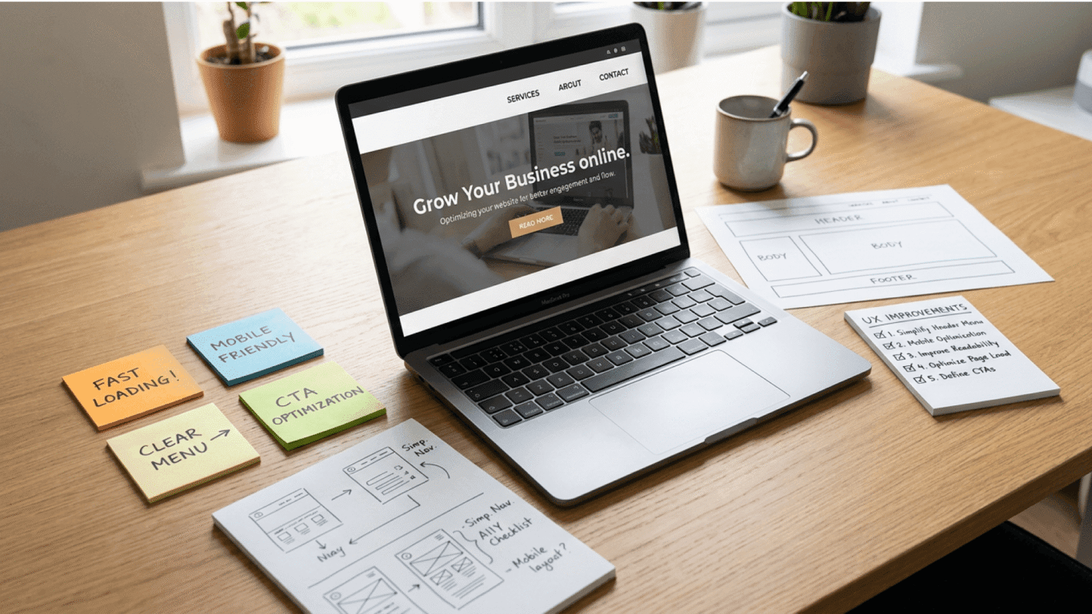
You can dramatically improve the WordPress user experience by walking through your own site as if visiting for the first time. From homepage to conversion point, note where hesitation happens, where clarity drops, or where effort increases. Every moment of friction is a design opportunity.
Using Analytics and Heatmaps to See the Truth
Data is honesty. Heatmaps show you where users click, scroll, hesistate, or ignore. Session recordings reveal confusing paths. Google Analytics through MonsterInsights shows behavior flow, top content, and search terms. All of this shapes a better WordPress user experience by replacing guesses with facts.
Making Your Site Truly Mobile Friendly
Tap targets must be large enough. Text must be readable. Images must be responsive. Menus must simplify. The mobile preview in the WordPress editor is just the start. A genuine WordPress user experience requires testing across real devices, not just toggled screen sizes.
Improving Accessibility for Everyone
Accessibility is essential for UX and SEO. Adding alt text, verifying color contrast, creating label linked forms, enabling keyboard navigation, and allowing adjustable text sizes all contribute to a meaningful WordPress user experience. Tools like WP Accessibility make improvements easier.
Simplifying Navigation and On Site Search
When navigation is intuitive and search is accurate, the entire WordPress user experience improves dramatically. This is especially true for WooCommerce stores and content heavy sites. Dropdowns, mega menus, and breadcrumbs help orient users, while better search plugins provide more accurate results.
Using Clean, Minimalist Layouts
Clutter confuses users. Clean layouts calm them. Strategic minimalism makes the WordPress user experience more focused and less overwhelming. SeedProd and similar tools help build beautiful layouts that prioritize clarity.
Presenting Content in a Skimmable, Friendly Way
Most users skim before they commit. Clear headings, short paragraphs, supporting visuals, and occasional interactive elements like polls make the WordPress user experience more enjoyable and more digestible.
Speeding Up Your WordPress Site
Performance is one of the biggest indicators of UX quality. Caching, CDNs, lazy loading, WebP images, compression, and regular performance checks keep the WordPress user experience fast and fluid.
Testing Changes With A B Testing
You cannot improve what you do not measure. Testing headlines, hero sections, layouts, CTAs, and page structures is one of the most efficient ways to strengthen the WordPress user experience over time.
Being Selective and Strategic With Content
More content does not mean better content. Every page must serve a clear purpose. Pruning outdated pages and refining content clusters creates a stronger WordPress user experience and better SEO signals.
Encouraging Interaction and Community
Live chat, quizzes, polls, enhanced comments, and private communities increase engagement and keep users returning. A richer WordPress user experience is one that feels alive and responsive.
Catching Invisible Breakages With Visual Regression Testing
WordPress updates can silently break your site. Visual regression tools help spot changes early so the WordPress user experience stays smooth and consistent.
WordPress Plugins That Improve the WordPress user experience
Performance plugins like WP Fastest Cache or WP Rocket boost speed. Ninja Forms and WPForms improve form interactions. Hotjar and Crazy Egg reveal behavioral insights. Broken Link Checker ensures maintenance stays tight. Advanced search tools enhance discovery. Together they all help create a reliable and delightful WordPress user experience without overwhelming your workflow.
Frequently Asked Questions
What is the difference between UX and UI on a WordPress site?
UX is the full experience from navigation to content flow to interaction. UI is the visual layer. You need both for a strong WordPress user experience.
Does mobile responsiveness really matter for UX and SEO?
Yes. A mobile friendly layout is non negotiable for both engagement and ranking. It is a core part of a high performing WordPress user experience.
How can I make my WordPress site more accessible?
Use alt text, readable fonts, clear labels, and proper contrast. These improvements instantly strengthen the WordPress user experience.
What role do CTAs play in UX?
CTAs guide users to action. Without them, the WordPress user experience loses direction.
Why do high quality images matter for UX?
Images tell your brand story, build emotional connection, and increase engagement. Optimized visuals are key to the WordPress user experience.
Conclusion: Bringing It All Together
Recap: UX as how your site works and feels, not just how it looks
Key levers: usability, speed, clarity, accessibility, and feedback loops
Reminder that small, iterative improvements compound over time
Call to action: audit one key page, implement a few changes, measure, then expand